 *
*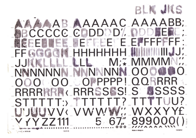
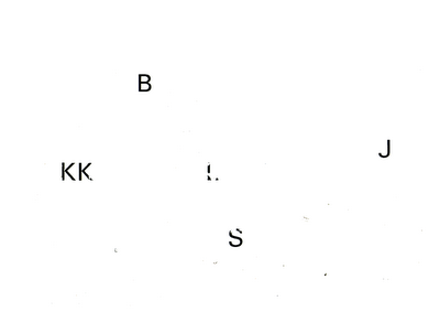
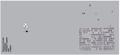
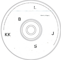
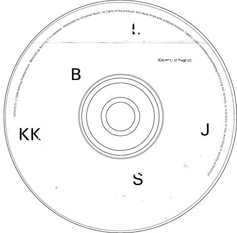
I have been doing a lot of stuff with the BLK JKS lately, the piece underneath the clover was a sort of collage that i made out of old Letraset pages i found about ten years ago. I like the fact that other people scratched off the letters and not me. So i thought it would be cool for the cover of the EP that's supposed to be released soon but we will soon see if that is going to happen... I was originally using it for the promo disc that i have been sending out to people. I'm making them by hand so i I'm only making twenty of them and numbering them. It was nice to make things with my hands again after sitting in front of a machine for so long. Maybe i will even start painting again.
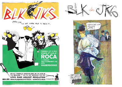
The logo at the top was drawn by my lady on a loose piece of paper for some project she was busy with, i scanned it in and copied one of the leaves and made it black and moved it to the bottom so it looks like a four leaved clover that lost its fourth leaf. Kind of like its losing its luck. Mpumi said to me that if anybody had to ask him what a Black Jack looked like that logo says it perfectly. It goes without text, just plain by itself.
* LETRASET
Letraset was formed to exploit the invention of transfer sheet lettering in 1959. Letraset always ran an adventurous letter design program and from 1964 under the leadership of design director Colin Brignall, built a distinctive library of display typefaces.
The rise of the Apple Macintosh and the wide availability of digital fonts brought about the inevitable decline of transfer lettering. Letraset quickly converted the best of its library into digital format and continues to this day to develop typefaces under the Fontek brand. Acquired by the Swedish Office Supplies Group Esselte A.B. in 1981 Letraset was subsequently divested to the company’s management team in June 2001.Today, under the tagline Creative Opportunities, Letraset provides a broad range of digital and traditional design products meeting both professional and non-professional requirements.
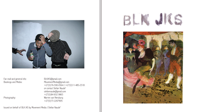
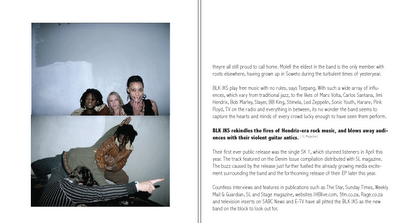

This was part of the booklet that goes with the promo disc, Warren took them at the Lark launch at Carfax or something. These are some flyer's was messing around with, the invisible man one went out a while ago, the animal cacharacter's with the shades on was originally made for a BOO! cover but they were not really into it so i always hanged on to them cause i just liked the look of them. The one with the Tolouse Lautrec painting of a dancing lady that says "I heard thye were SHIT" was cause somebody said to me that he heard they were shit. I spelled it wrong on purpose just cause i can, anyway the radio that she is dancing with has been used in layouts for Session, Hype, and Stage magazine. I get lazy like that sometimes.


1 comments
Hey dude your Letraset work is BEAUTIFUL, typography is crazy! I would love a print if you got some lying around that you maybe don't want?????
Enjoy cowboy
Post a Comment