A good friend of mine, Martin sent me these Clout 7"'s from Switserland or something. They came from a car boot sale and i got them in this nice red British mail envelope. Its like they are worth anything but i suppose its a bit of SA pride. These ladies were massive.
This has embossed letters - very fancy.
And then obviously i was left with a nasty little reminder on the back stating this... Anyway, atleast nothing inside was taken.


(ROBERT RAUSHENBERG)
I have a very cool neighbour, he is Dutch and we drink a lot of wiskey together when we have the chance. I Have always imagined that if Kurt Cobain was still alive he would have looked very similar to him cause they are about the same age. Anyway he owns this Talking Heads record called "Speaking in tongues (Robert Rauschenberg)" which he also bought in Europe as it came out. Its a printed vinyl and very rare and we also realised that it is worth a lot of money, a lot more that you think. Rauschenberg id one of my favourite artist and im definately wearing the green jacket when i hold this little number in my sweaty palms...


TALKING HEADS - Speaking In Tongues (Robert Rauschenberg )
Label: Sire Records Company
Catalog#: 92-3771-1
Format: Vinyl, LP, Limited Edition
Country: Europe
Released: 1983
Genre: Electronic, Rock Style: Leftfield, Synth-pop, Indie Rock
Credits: Artwork By [Cover / Package] - Robert Rauschenberg
THE SOUTH AFRICAN VERSION - LIMITED
This is what i have... a broken Talking Heads live 1979 copied CD that Loyd gave me one drunken night at the Bohemian. I was very excited and stuck it into my back pocket. I sat down at the bar and had another drink. The disapointment was clear enough when i got home to find two pieces in my back pocket.

TALKING HEADS - Live 1979 (ST(E)AK)
Label: Loyds computer at the Mail And Gaurdian
Catalog#: 9199 666 52
Format: Compact disc, CD, Limited Edition
Country: South Africa
Released: 1979 Copied 2006
Genre: Electronic, Rock Style: Leftfield, Synth-pop, Indie Rock
Credits: Artwork By [Cover / Package] - Stefan Naude ( ST(E)AK

TALKING HEADS - Live 1979 (ST(E)AK)
Label: Loyds computer at the Mail And Gaurdian
Catalog#: 9199 666 52
Format: Compact disc, CD, Limited Edition
Country: South Africa
Released: 1979 Copied 2006
Genre: Electronic, Rock Style: Leftfield, Synth-pop, Indie Rock
Credits: Artwork By [Cover / Package] - Stefan Naude ( ST(E)AK
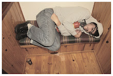
 I found some of my old work on a disc, none of the these graphics exept for the top one was printed. Its a picture of Gavin Morgan and i think it was taken by Gavin Scott. Gavin really chucked his board in the air even though i remembered a lot of people thought i put it in afterwards. It was for a KFD tour ad or something in Session magazine but i dont have the ad anymore. I did some t shirts for KFD Modern living tour, but i dont know where it is now. I always tried to get some graphics on a board, i have done heaps for different companies and none of them ever got printed... Apparently the didn't fit the image of the company or something.


*

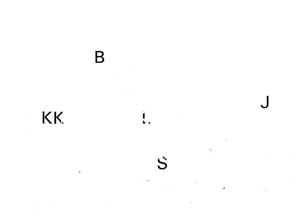
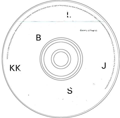
I have been doing a lot of stuff with the BLK JKS lately, the piece underneath the clover was a sort of collage that i made out of old Letraset pages i found about ten years ago. I like the fact that other people scratched off the letters and not me. So i thought it would be cool for the cover of the EP that's supposed to be released soon but we will soon see if that is going to happen... I was originally using it for the promo disc that i have been sending out to people. I'm making them by hand so i I'm only making twenty of them and numbering them. It was nice to make things with my hands again after sitting in front of a machine for so long. Maybe i will even start painting again.
The logo at the top was drawn by my lady on a loose piece of paper for some project she was busy with, i scanned it in and copied one of the leaves and made it black and moved it to the bottom so it looks like a four leaved clover that lost its fourth leaf. Kind of like its losing its luck. Mpumi said to me that if anybody had to ask him what a Black Jack looked like that logo says it perfectly. It goes without text, just plain by itself.
The logo at the top was drawn by my lady on a loose piece of paper for some project she was busy with, i scanned it in and copied one of the leaves and made it black and moved it to the bottom so it looks like a four leaved clover that lost its fourth leaf. Kind of like its losing its luck. Mpumi said to me that if anybody had to ask him what a Black Jack looked like that logo says it perfectly. It goes without text, just plain by itself.
* LETRASET
Letraset was formed to exploit the invention of transfer sheet lettering in 1959. Letraset always ran an adventurous letter design program and from 1964 under the leadership of design director Colin Brignall, built a distinctive library of display typefaces.
The rise of the Apple Macintosh and the wide availability of digital fonts brought about the inevitable decline of transfer lettering. Letraset quickly converted the best of its library into digital format and continues to this day to develop typefaces under the Fontek brand. Acquired by the Swedish Office Supplies Group Esselte A.B. in 1981 Letraset was subsequently divested to the company’s management team in June 2001.Today, under the tagline Creative Opportunities, Letraset provides a broad range of digital and traditional design products meeting both professional and non-professional requirements.


This was part of the booklet that goes with the promo disc, Warren took them at the Lark launch at Carfax or something. These are some flyer's was messing around with, the invisible man one went out a while ago, the animal cacharacter's with the shades on was originally made for a BOO! cover but they were not really into it so i always hanged on to them cause i just liked the look of them. The one with the Tolouse Lautrec painting of a dancing lady that says "I heard thye were SHIT" was cause somebody said to me that he heard they were shit. I spelled it wrong on purpose just cause i can, anyway the radio that she is dancing with has been used in layouts for Session, Hype, and Stage magazine. I get lazy like that sometimes.

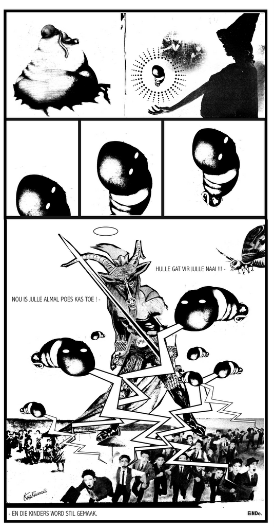
Hell o friends... what follows next is my version of the Dark Lord swiping away on the day of reckoning. The style was based on a previous comic i used to do for SESSION skateboarding magazine a couple of years ago called "No dogs body". This one is not finished yet but is being pitched for a new comic book brought out by Mark Kannemyer (Lorcan White" early next year. He might not go for it because its more of a cut and paste than it is drawn but the sense of humour is still there so i hope he goes for it. It was the first time i ever did something in Afrikaans and it felt a bit weird making something out of childhood fairy tales that used to keep me awake at night... If old Nick pulls in here one day i hope it would be like this or rather this is how i envisioned it... with all those penis balloons firing randomly at all the humans running like sheep all along the beach. I should probably ad some trumpets too. I got the devil from the first Slayer album called "Show no mercy" but i will talk more about that when the blasted thing is finished ! So here is a sneak peek of the tale simply called BOK NAAI.
 And then just to top it all off i thought i would add this pic as a bonus. This our man Magus Anton Szandor LaVey (1930-1997), Founder of the Satanic church and one of his rocking cocktail parties at his house in S.F.By the looks of it he certainly seems to know how to entertain. How can any person actually take religion seriously with costumes like this ! Jaxon pointed out that they look quite similar to priests in the Catholic church...I agree, if the nuns walked around in the nude with black rubber animal heads they could completely relate.
And then there is the quote of the month "We are looking for a few outstanding individuals..." on the opening page of the Church of satan website and i thought to myself. "I could be that individual..."
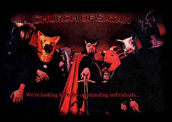 WEB - www.churchofsatan.com (Good for a laugh)
 SONG OF THE HOUR - "South of heaven" - SLAYER - 1988
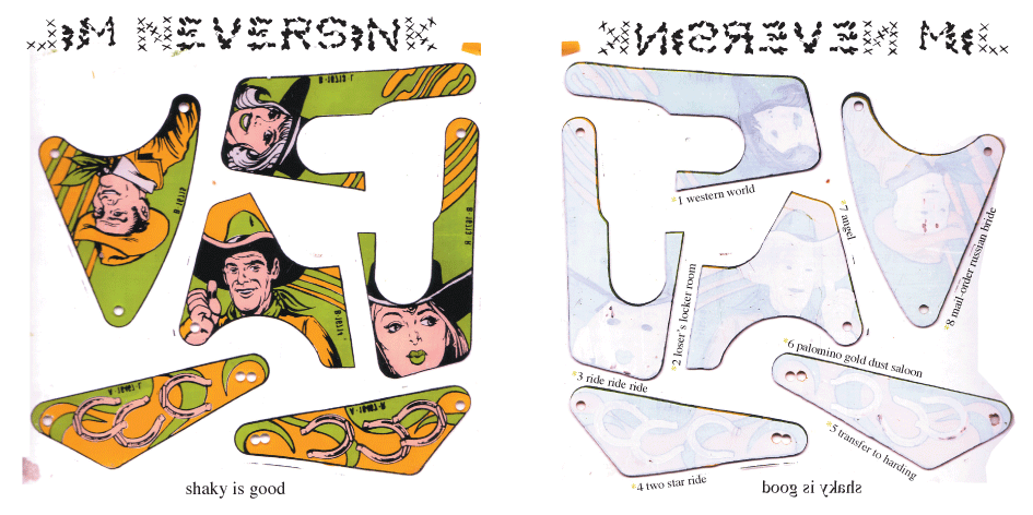
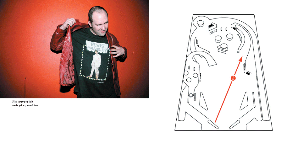
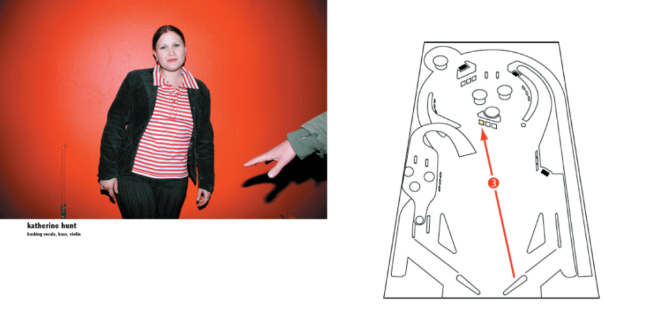
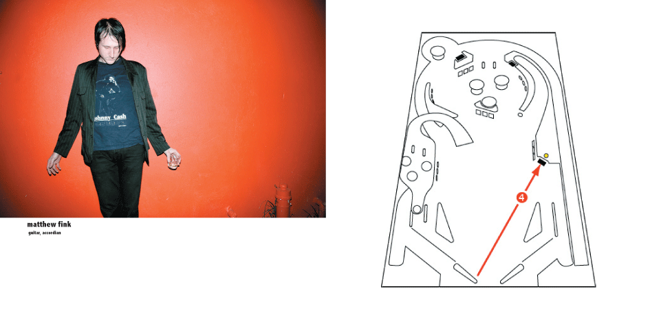
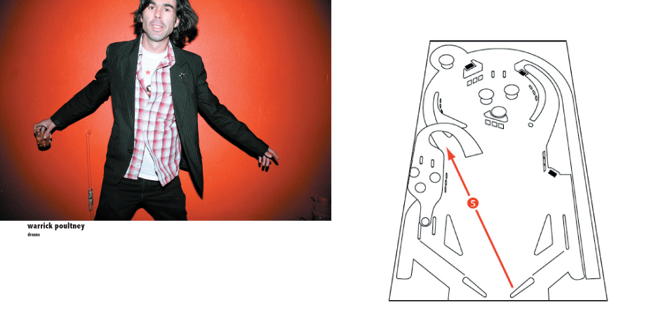
About a week ago Warren and myself left the Jim Neversink show at the Bohemian very emotional. It was one of the best live gigs i had ever seen. They are apparently busy recording at the moment right now or they have finished but i found out that they did not have a album cover yet so i started working on one earlier this week to pitch to them. The idea was based on these old pinball machine parts i had and some of the tables plans that i found on the internet. The cover parts were scanned in from silkscreen prints i had from a second hand shop called STUFF i used to work in. I called up Micheal (Jim) and asked him what the album title was and he said "Shaky is good", which i thought was suprisingly very related to the pinball idea, like when your tilting the machine or something. Anyway Warren supplied the photos from a drunken fashion shoot we did one night at back to Basics, allthough the shots had been used in STAGE magazine (all but one) we are planning on doing a new shoot to suit the band if they agree on the idea...